ellexx – the finance app for women

We are developing a mobile app for our customer ellexx from Switzerland to close gaps in financial education

#mobileApp #finance #UX
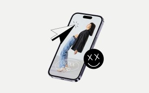
A smartphone showing a female person wearing jeans, a dark blazer and dark hair. She is also wearing a white top and a black belt. The person assumes a contemporary dance posture. An illustrated cursor "sticks" over the smartphone. There is also a smiley face, which is black and has white X-eyes and is smiling. The photo of the person also shows the ellexx app lettering in the ellexx corporate font. The whole thing is on a cream-colored background  Translated with DeepL.com (free version)

Our Impact

  • An arrow pointing downward standing in a circle

    Over 4,500 downloads in Switzerland in the first two weeks

  • Frame with a one on it which is double underlined

    1st place in the Swiss app charts in the
    Finance category, Top 10 Overall

  • Badge with a star

    ≈ 4.5 stars in the stores

The Challenge

The financial platform ellexx wants to close the financial education gap - especially for women. To do this, they want to expand their current offering, which is limited to their website. The goal: a financial app that rethinks the topic. One that is based on lifestyle apps that are fun and inspiring. 

ellexx - we are in! Our challenge is to bring complex features together intuitively and harmoniously to create an all-in-one solution. This means that formats that could each be their own app have to be molded into one solution. This is how we manage to combine articles, videos, courses, checklists or podcasts with innovative ideas such as moneytype, budget tools or personalized financial tips to create the perfect solution. 
The Solution

With ellexx, we are developing an all-in-one app that clearly stands out from other apps in terms of design and handling. The aim is to make various topics and formats easy to understand and accessible in order to provide access to knowledge, especially for beginners.   

To achieve this, we focus in particular on user-centered development with a focus on user experience and user interface. In addition, we rely on clear storytelling to make the content easy to understand. With the "Moneytype" feature, we have developed an innovative tool that lays the foundation for personalization. A detailed questionnaire is used to determine the relationship users have with money. This covers various aspects of financial behavior and individual priorities. Based on the answers, the app is tailored and offers personalized financial solutions and knowledge. 

Three mobile screens next to each other, all of which show the interface of the ellexx app. Left screen: ellexx logo top left. Top right a bell/notification icon. The person pictured is wearing a dark blazer, dark hair, and blue jeans. Moves in a dance-like manner and assumes a relaxed, almost dancing posture. Under the image is "Welcome Carolin - your financial power tool, no matter where life takes you, this app will accompany you in all money matters." Below that is the menu with "Home," "Learn," "Finances," and "Profile." In the middle of the screen: "Your investment potential," a white-purple circle with the amount 6,900 Swiss francs. Arrows pointing downwards to the text "Done." You have 6,900 Swiss francs left each month! Bottom left is the "Back" button; bottom right is the "Next" button. Right screen: "Your Moneyzone" Nav centered at the top: For you / Budget tool / Products / Advice. Pictured: Person with white shirt and dark jeans and long dark hair leaning casually against a wall. Underneath the picture is "Your personal finance area". Below that is the menu "Home", "Learn", "Finances" and "Profile"
Device with app charts. ellexx app is in first place and a black encircling circle is placed above it. To the right of it are two illustrated balloons grinning.

Das Ergebnis kann sich sehen lassen

Demand for the app is high. The app is already number 1 in the Swiss App Store charts in the Finance category and number 8 in the overall Swiss app charts. 

Setting the stage

Due to the existing and regular content of the website, we also redesigned the backend structure. 

Mobile device image of the app. Heading "Your learning area", navigation "Articles", "Courses", "Coachings", "Checklists". A picture of a person looking into the camera with the tag "Online Coaching". Title of the post "Personal Branding on LinkedIn", below that is another post on the topic of "Online Coaching". To the left of the device is a line that crosses over each other and has circles at irregular intervals.

Individualized to the goal 

The most important goal of the app: to prepare it in such a way that users can find the content that is most relevant to them personally as quickly as possible. To achieve this, we have built features that allow users to define their personal preferences. The app personalizes each feed with content that suits the person and the respective phase of life. 

An illustrative mobile with the symbols banknotes with euro sign, a credit card, tied coin stacks, a bitcoin coin, and a card with an illustrated ellexx logo with smiley

  • "We are very grateful for the collaboration with Exxeta. Exxeta and ellexx are not only a good match because of the two xx, but also because of the unbridled joy of innovation and digital change. Without the innovative drive and entrepreneurial empowerment of the entire Exxeta team, our app would not exist today. We were able to benefit enormously from all of their expertise and are more than enthusiastic about the power of collaboration. We can say that not only heartbeat, but above all lifeblood was put into it."

  • "Together with ellexx, we have managed to develop an app that offers real solutions with a modern design. We worked very closely with the ellexx team and were able to combine their creative ideas with our technical know-how."


Let's connect

Roland Wulz has short hair, rectangular glasses, a dark grey shirt, beige trousers and has his hands on his hips.

Want to learn more?